[WIP] TS3 UI "Krystal"
Project: "Krystal" UI mod
by Lyralei
Uploaded June 7, 2025, 2:59 p.m.
Updated June 7, 2025, 2:59 p.m.
[WIP] TS3 UI "Krystal"
I figured it would be cool to finally publicly share what I've been working on behind the scenes, as well as some mockups!
A few of you on Patreon or Discord may have already seen sneak peeks/given feedback. I kept things quiet because I wasn’t sure I’d even do it in the first place as a next modding project, and I didn’t want to let anyone down.
Luckily, @lazyduchess’s Monopatcher made the job ten times easier. The biggest hurdle was that I would've had to make a core mod to override UI code (I’m normally anti–core mod), but the patcher solved that and let me push ahead.
Creating the Mockups
Fun fact: I actually have a degree in UI/UX design! (for websites) While principles like “How wide should this padding be?” or “Which colors send the right signal to the user?”—game UI is a whole different beast.😬
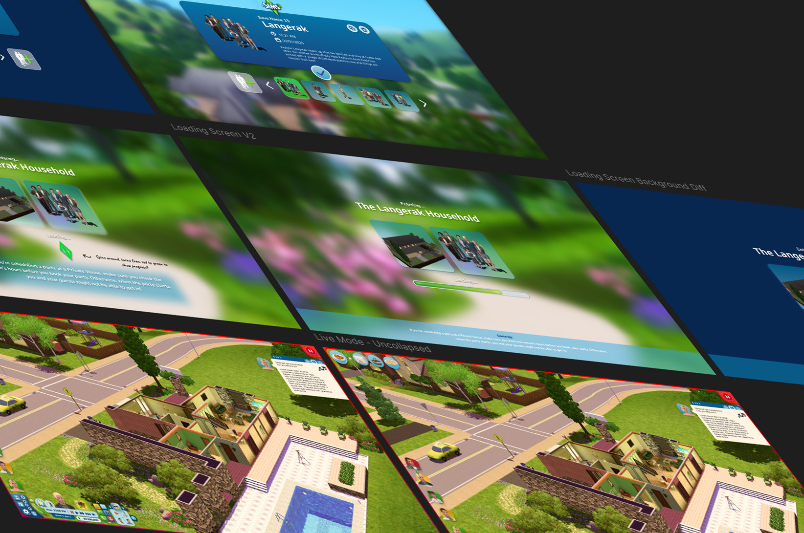
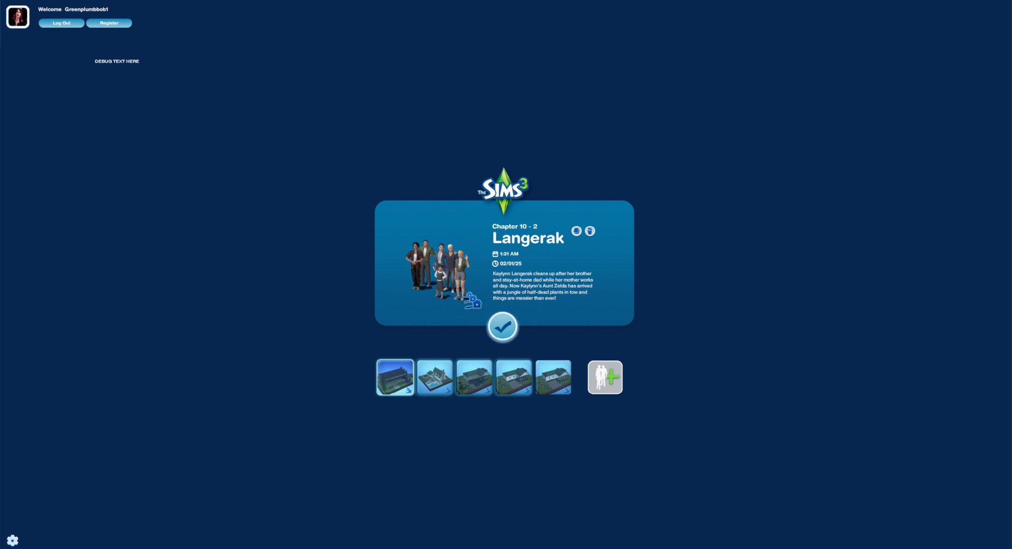
Main Menu
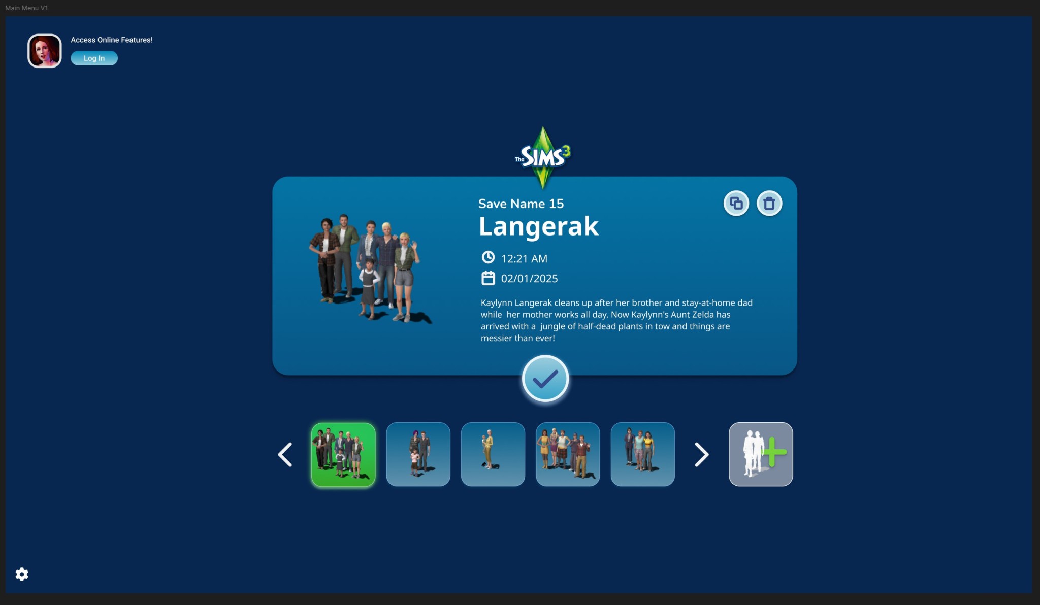
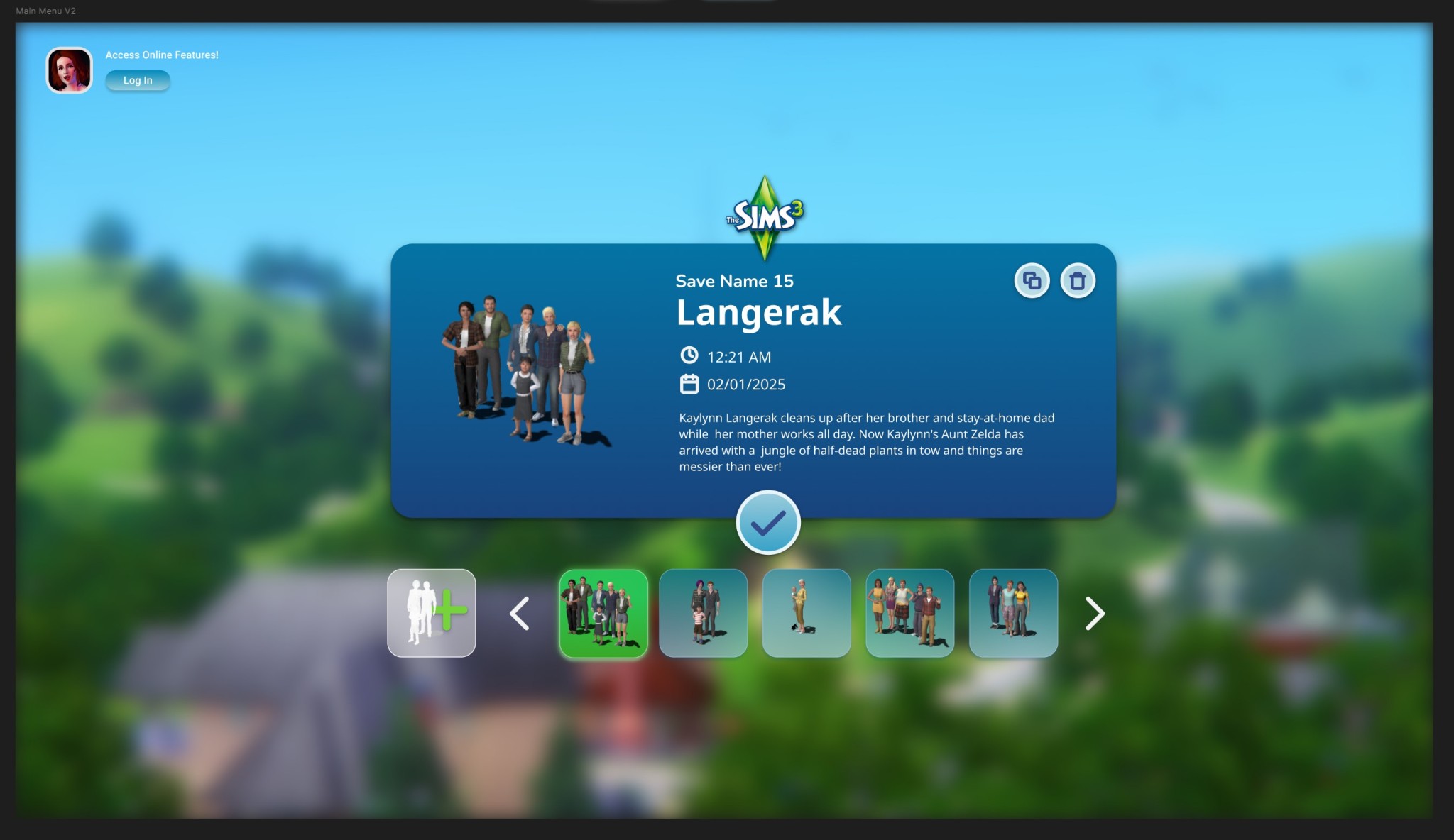
I started with the main menu:
- Cut the SimPoints clutter and the “Buy TS4!” banner—after a decade, we get it exists 😉.
- Grouped items into clean blocks
- Added a text-free “Create New Family” icon
- Swapped lot thumbnails for family shots (still baffled by EA’s original choice).
- Dropped an options gear in the bottom-left; might label it if it’s too subtle.
- Different backgrounds: one solid blue, one closer to the classic gradient.
A lil' sneek peek of where I'm at:
She's not finished, but it's definitely getting there! 😉
Load Screen
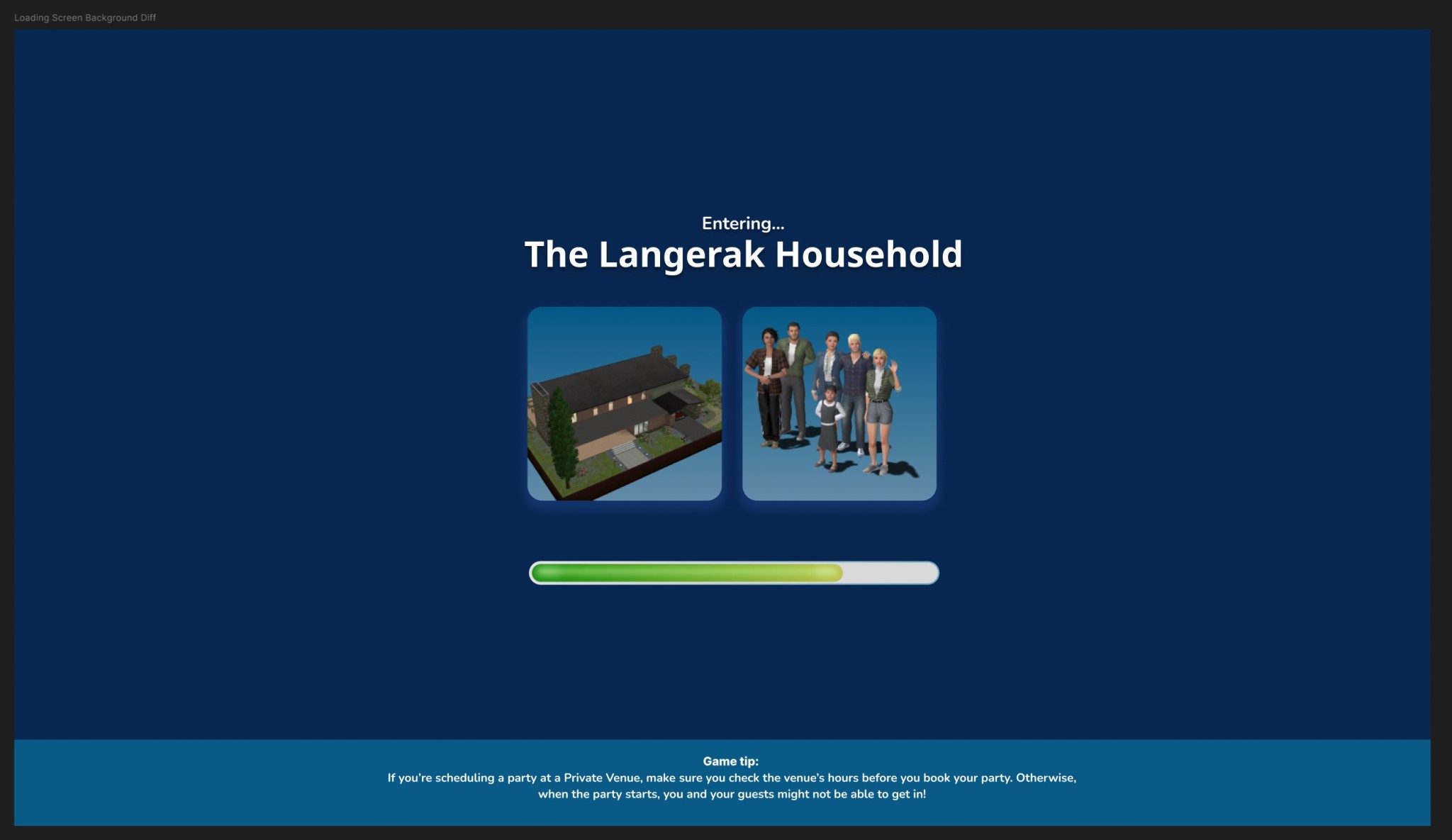
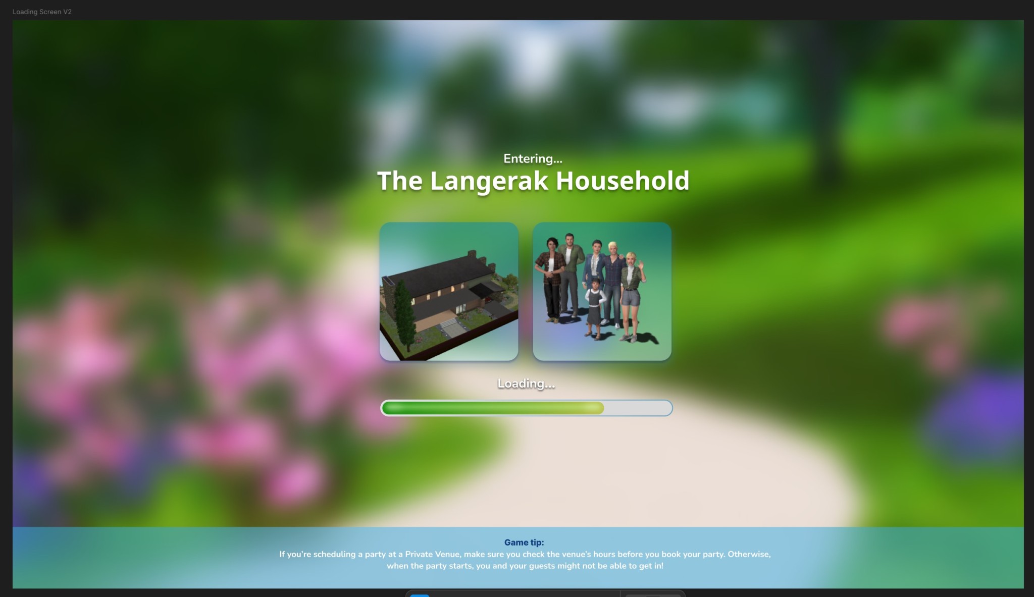
Not much has changed here! It's just less... busy I suppose, lol!
- 2 Different backgrounds to choose from
- Moved the Game Tips to the bottom, so the main focus stays on that loading bar 😉
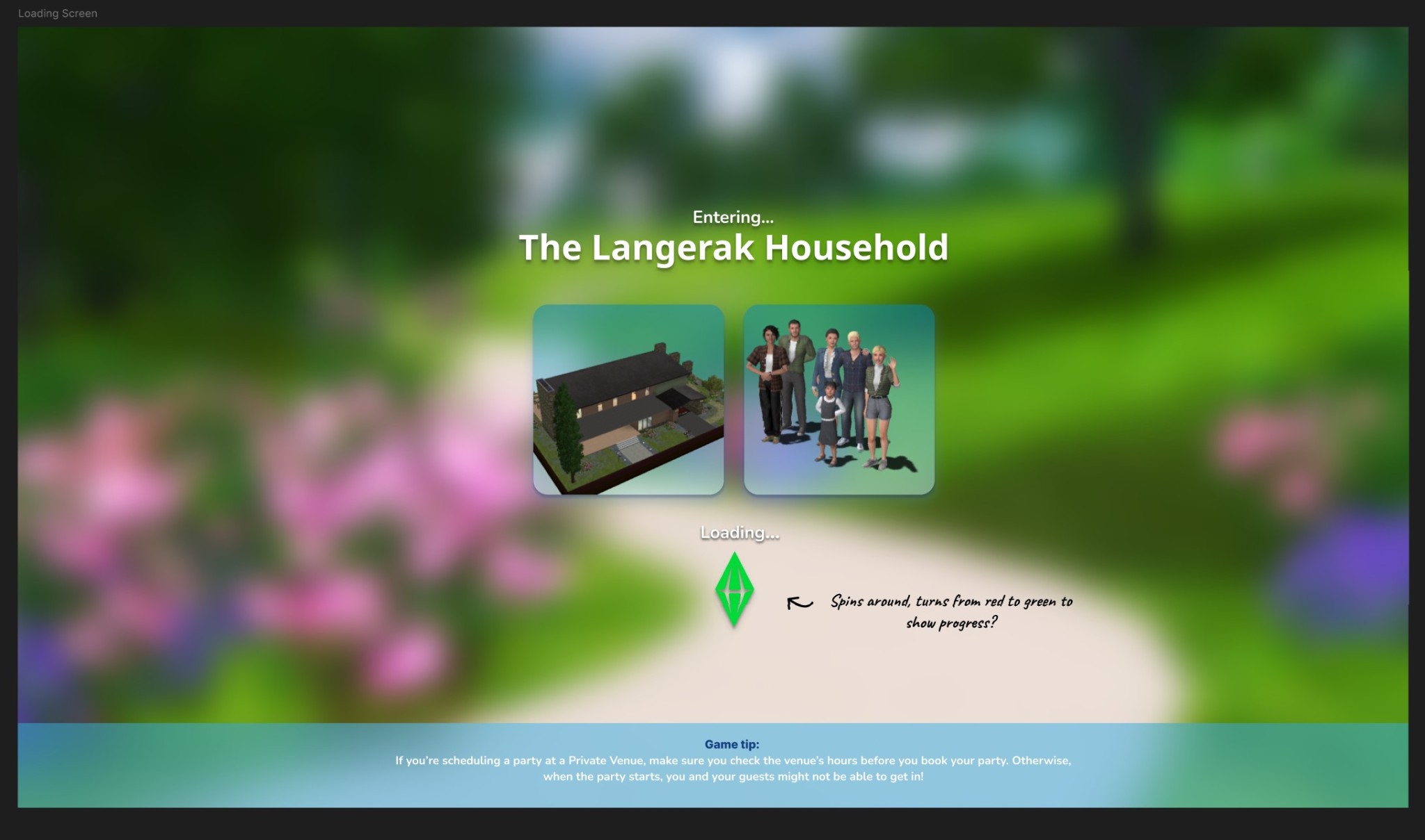
I also have a third option but I'm strongly leaning towards just having the loading bar as it's the most clear!
Live Mode
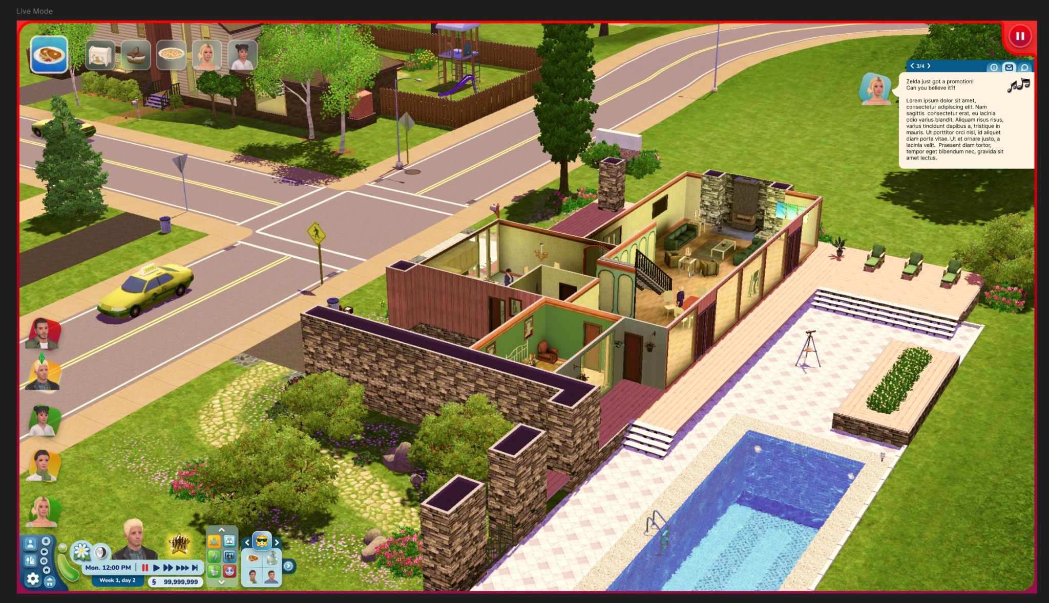
The hardest of them all lol. Kudos to EA for figuring that one all out! I really struggled with this one in regards to shape and what to even move around/remove!
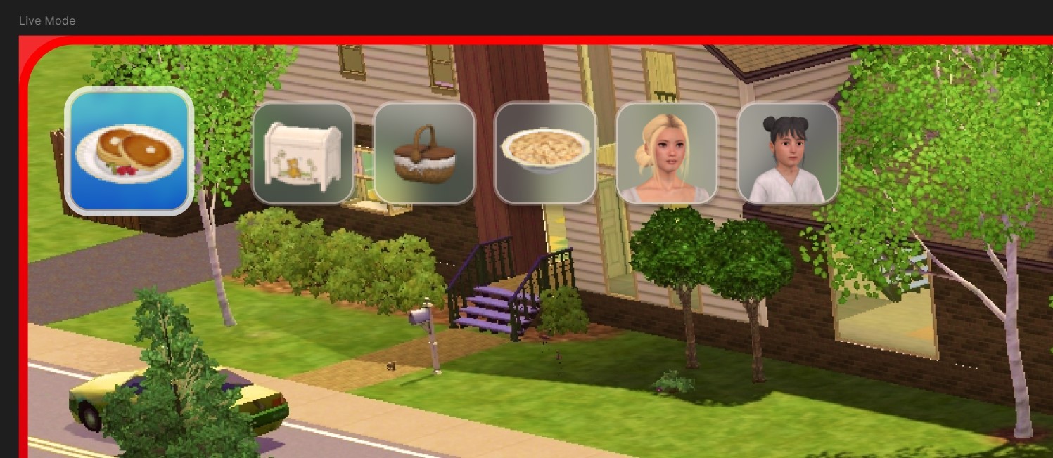
I figured, it should be nice to pull really into that glassmorphism I've been using over the Mockups! Now I do realise that it can hamper user experience in the sense of not being able to read anything. But these are pictures! So that should be all fine and dandy.
The active item in the queue will now be more "visible". The queued item however, you'll see look a bit more "unactive" compared to what the current version has.
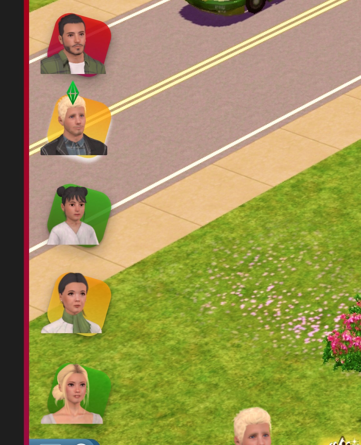
I also completely overhauled the thumbnails for your sims, showing their moods a bit better, and giving the active sim a tiny plumbob! :D
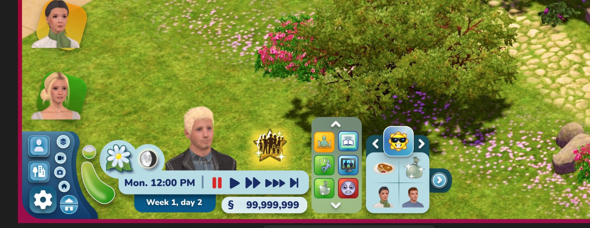
And now the real deal: The control panel! You might notice it's not the whole thing, but I'm still working on that part.
I removed the camera controls from the panel. However, upon feedback, I did hear that it's better to have them as some people are limited in their hand movements on their keyboard and that those controls are really useful. So I will make sure to share 2 versions :)
I also realised I completely forgot the Build/buy mode buttons 😬 So, err, stay tuned for that? lol.
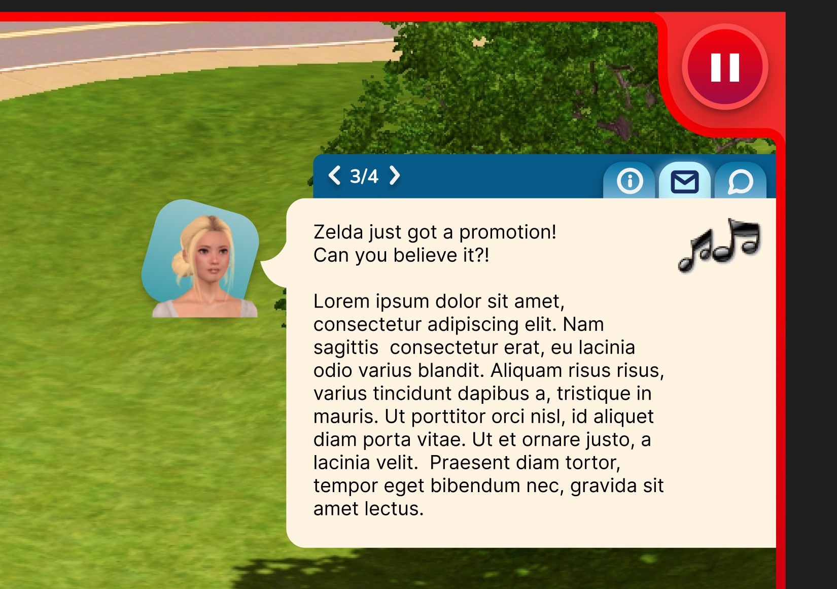
Notifications I really just tidied up :p
I am aware that the space where the text is and the thumbnail is huge, and normally I'd wrap the surrounding text, but apparently in TS3's UI stuff that's practically impossible. Hence that they got this "2 column" effect to them 😉
About releasing the UI:
I'm hoping to release them all in bits and pieces! So first up is the Main Menu (and possibly the Loading screen given it's simplicity).
After that, I hope in my second "update" to release a big portion of Live mode, but that's a bigger task on it's own of course 😉
Any feedback at this point is also completely welcome by the way!